Divergent Designs
I designed a website to promote my business and display my work. I built it using Astro, which I chose for its flexibility and ease of incorporating TypeScript. The overall layout demonstrates my skillset and personal style.
Content
I wanted to make the booking process as simple and transparent possible with these features:
- Packages with set pricing: Having to send an email to get a quote can be daunting, especially when the client may not know what features they want.
- Initial consultation booking form: Again, writing an introductory email can be daunting, so I offer the option to schedule a free initial consultation without having to correspond in advance.
To give the client confidence in booking, I included:
- My unique background: Including education, coding bootcamp, and artistic influences.
- Other fun facts: To humanize me.
- Testimonials: To provide insight into the experience of working with me.
- Portolio: Each of which has information about the projects as well as supporting images.
I organized my services by category and compared the pros and cons of each package.
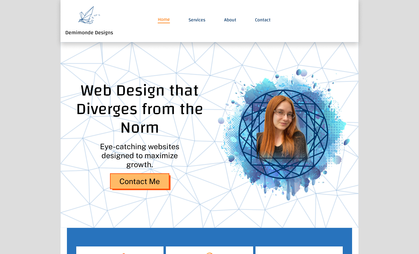
Layout
I drew the user’s attention to elements that would initiate communication, such as contact forms and the initial consultation form.
My goal was to organize information about my services in a structure that was as simple and intuitive as possible. I also highlighted pricing information, so the user could find it and jump to it quicikly.
Style
My theme centered around two contrasting motifs:
- Paint splatters: Which had round forms and symbolize the creative, artistic aspect of web design.
- Geometric patterns: Which have sharpe edges. They symbolize neatness, structured information for clean UX, and the interconnected aspects of web design.
The challenge was to balance these motifs harmoneously in every element.
Colors
- Blue: Is a calming color that also reflects the fluidity of the paint splatters.
- Orange: Reflects the sharpness of the geometric patterns. I use organge to create a sense of urgency around the calls to action. It’s also the color of ADHD, my neurodivergent trait, which makes my braind more personal.